The Art of Custom Home Interior Design: Harmonizing Color and Texture
General
10 months ago
In custom home interior design, color and texture are everything. While furniture and home layout play a role in your home’s design, color and texture bring it all together.
Color affects more than just the visual aesthetic of a room. Color can evoke emotions and moods. Let’s dive into how color and texture can work together to create harmony and balance in your home.
Color Psychology
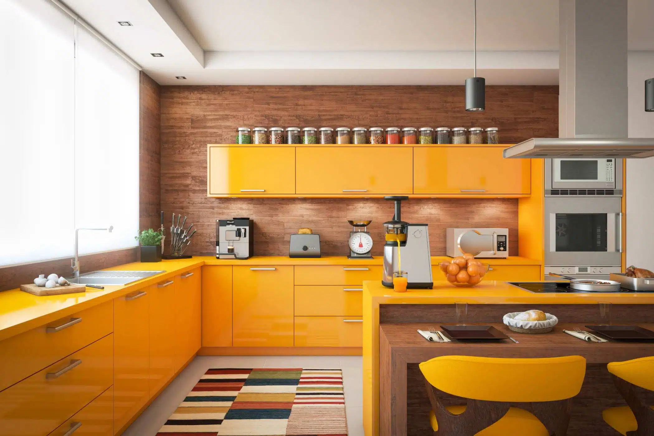
Color psychology suggests that the colors in your home can affect your behavior and overall mood. Typically, warm, bright colors evoke feelings of energy and happiness while dark, cool colors give a more calm and soothing feel.
Choosing where and when to use certain colors throughout your custom home can make a big difference when it comes to your overall mood and mental health. Warm colors are usually best used in entertainment spaces like the kitchen or living room while cool colors should be reserved for places of relaxation like your bathrooms or bedrooms.
Color Palette
When choosing your color palette, something to keep in mind is the 60/30/10 rule. This is a common interior design rule that states that 60% of the room should utilize a dominant color. Then, 30% should be a secondary color or texture, and 10% should be an accent.
When choosing which specific colors to use, consider using the color wheel and pairing analogous, complementary, or monochromatic colors together. Another great place to find ideas is by looking up color and design trends to see what other people are doing that reflects what your vision is for your home.
Dominant Color
The dominant color is the main color for your room design. It’s the anchor for all the other colors you choose to utilize.
Since it should take up 60% of the color in the room, the dominant color should be used for larger areas. This includes the walls, large pieces of furniture, or even area rugs.
Secondary Color
The secondary color is the balancing and supporting color. It’s used only half as much as the dominant color and gives the room a sense of contrast.
It shouldn’t be as flashy as the accent colors, but it doesn’t have to be a neutral color. A great way to use the secondary color is on curtains, bedspreads, or accents walls or chairs.
Accent Color
Accent colors are the fun pops of color that typically only take up around 10% of the room’s color. The accent color isn’t always on the walls, rather it can be found in various items and decorations throughout the room.
Add throw pillows, artwork, or other simple decorations that include your accent color to bring some extra charm to the space.
Mixing Materials
A great way to incorporate an accent is through the use of other materials. Whether you choose to add a stone fireplace, a wooden accent wall, or even marble shelves, using different materials throughout your custom home can create a unique feel.
Consult your color palette and be sure that your textures fit your design plan. Or, instead of using an accent color, use the 10% set aside for an accent color on an accent texture.
Get Started On Your Custom Home’s Interior Design Today
At Timber Rock Construction, we want you to have the custom home of your dreams. We understand color theory and can help you choose what colors and textures make sense for your home when it comes to custom home interior design.
We’re dedicated to staying at the forefront of the home-building industry by incorporating the newest designs and technology into our custom builds.
If you’re ready to get started on your own custom home or remodel, contact us to get started today!
You May Be Interested In:

How to Choose the Perfect Plot of Land For Your Custom-Built Home
4 days ago by Tyler Miller

The Long-Term Benefits of Energy-Efficient Home Design
3 weeks ago by Tyler Miller

One vs. Two-Story Homes: Which Is Best For You?
1 month ago by Tyler Miller
Designing Outdoor Living Spaces to Complement Your Custom Home
2 months ago by Tyler Miller